mak frankfurt (inofficial)
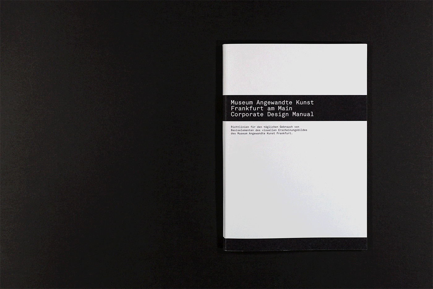
corporate design
mainz, 2017
unofficial rebrand of the corporate design as part of a university project
In my studies at University of Applied Sciences Mainz, I chose to do a Corporate Design course called 'Rebranding Utopia' conducted by Mr Pataki. For my redesign I got to look for a Institution or brand I wanted to do a redesign for. After some time, I decided to rebrand the Museum Angewandte Kunst Frankfurt (Museum for the Decorative Arts). After weeks of research and visiting the museum I started with some concepts.
'The character of the surrounding environment had a decisive impact on the form of this building, not only in terms of the topography but also in respect of the local doppel villa topology. Designed as a part of a new cultural district on the banks of the river Main – the so called Museumsufer – this arts museum was a transitional work in that it was part of the conversion of a residential quarter to public-institutional use.
The accommodation of the program within the available site enabled the remainder of the area to be treated as a park, open to the surrounding community, to Sachsenhausen in the south and to the city across the river in the north. Articulated pathways and vistas enabled the site to be reorganized in such a way as to overcome the barrier formed by the villas lining the Main River.
The skewed organization of the plan was based on two intersecting geometries, on an orthogonal grid deriving from the Villa Metzler and on a discrepant second grid taken from the alignment of the river. The Villa Metzler is incorporated into the new composition by being inscribed into an open quadrant of its 16 square orthogonal grid. This initial grid was then overlaid by a second grid of exactly the same size, but rotated 3.5 degrees to correspond with the embankment. The superimposition of these two networks generates the formal order of the work throughout.
The Villa Metzler’s basic dimensions and the proportions of the villa’s windows became the basis of the square metal panel module and fenestration of the new building.'
Taken from: richardmeier.com
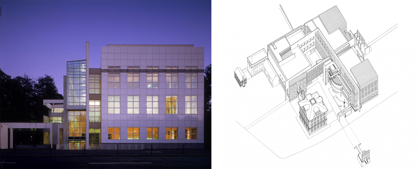
Picture: © Ezra Stoller/ESTO, Scott Frances
Both pictures from: Richard Meier & Partners Architects LLP
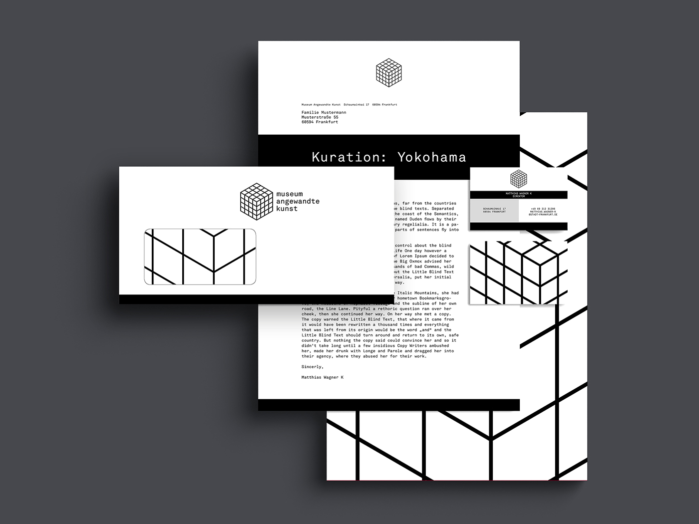
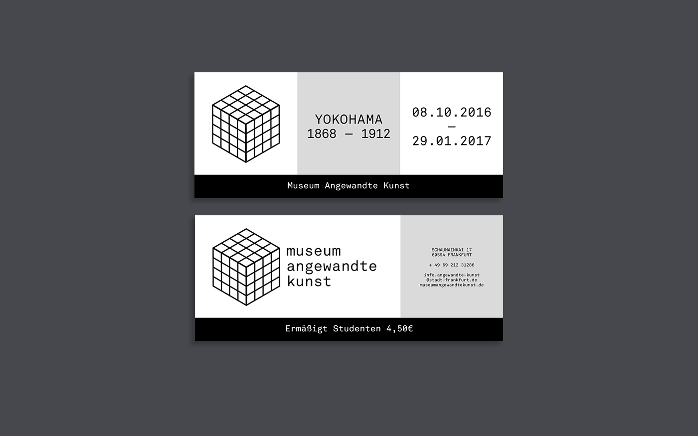
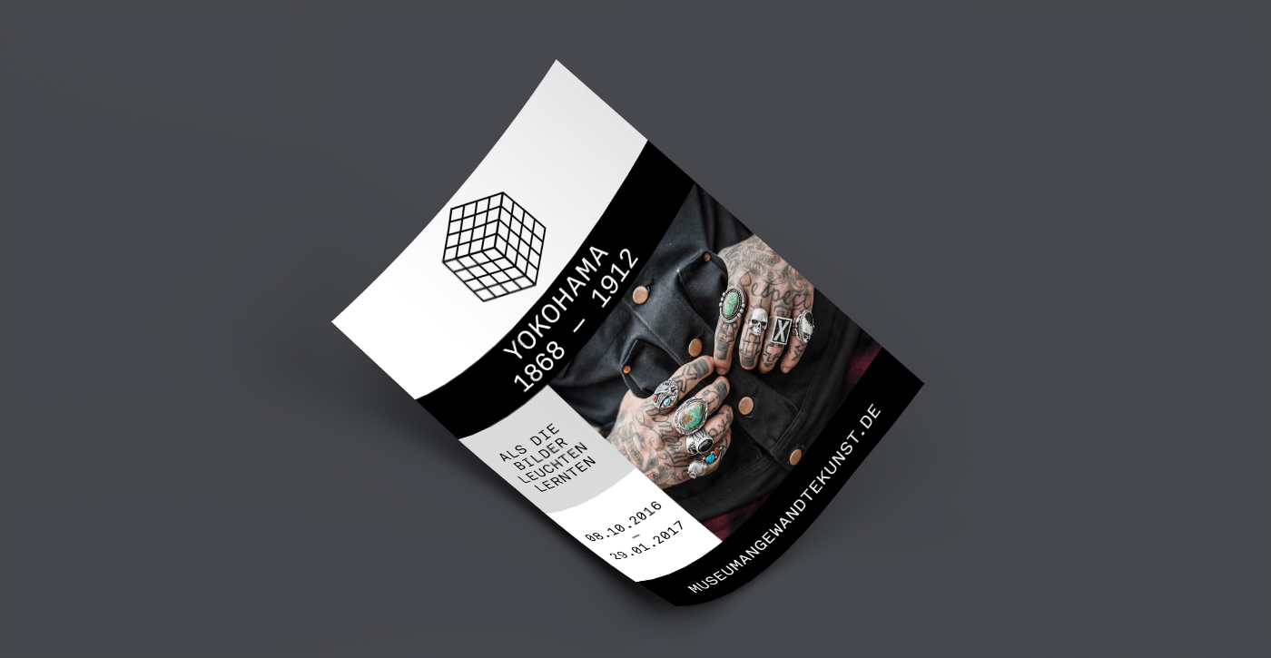
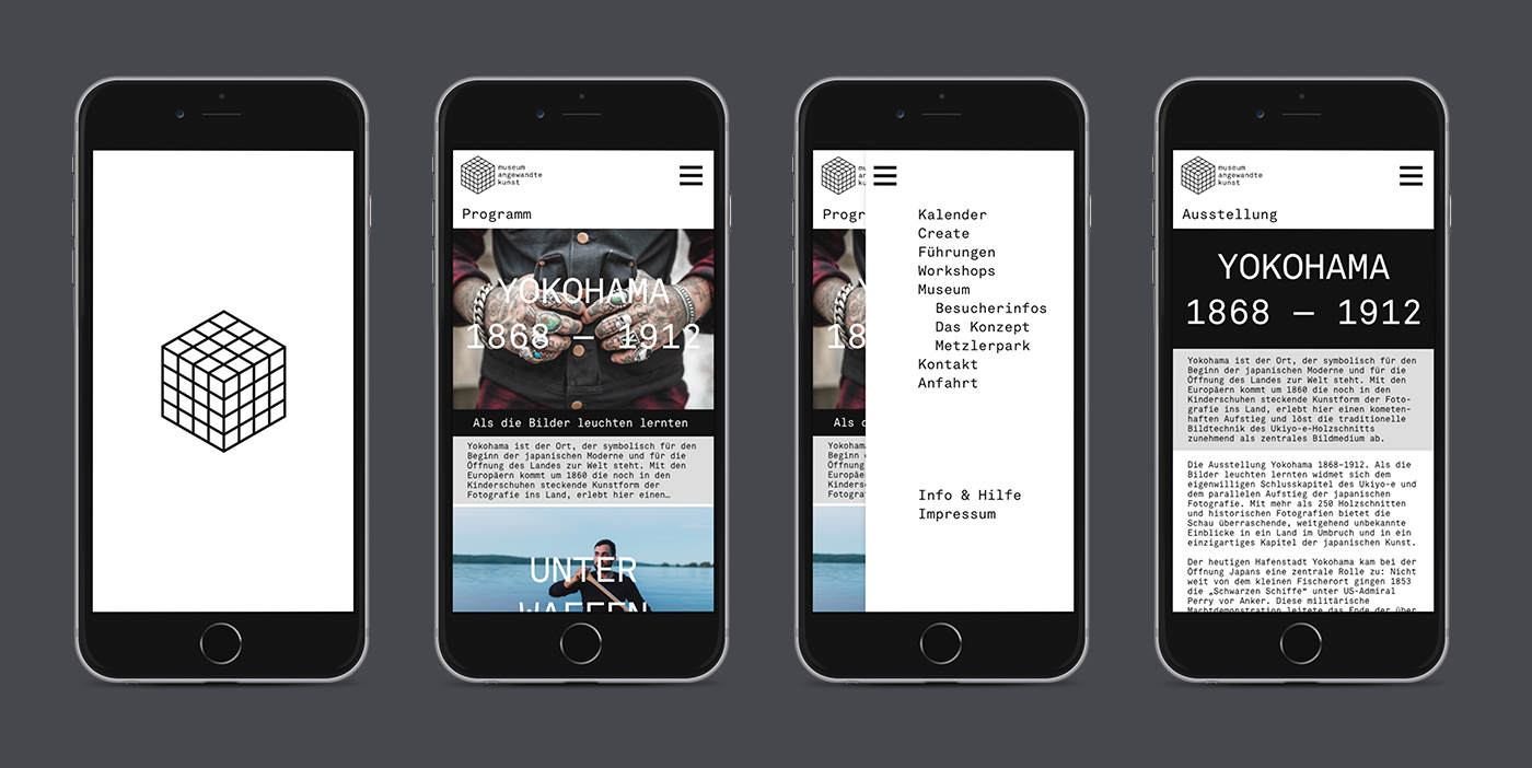
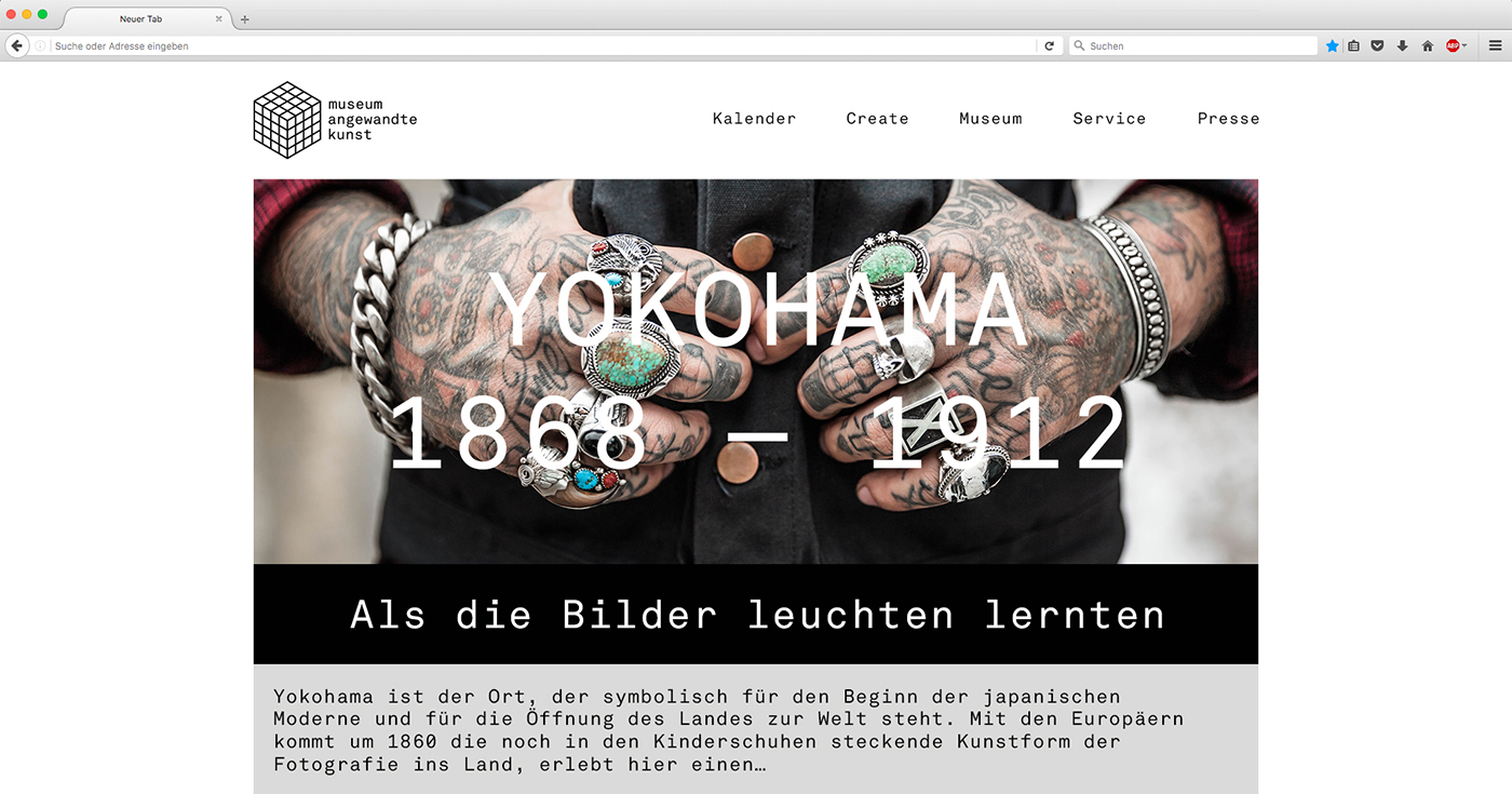
Based on the square panel front of the building, which is being transferred to multiple sides, I started to work on a logo based on the architecture. From there I tried to work with a grid, based on the front of the museum.
In addition to the logo, there is a visual. One to two black bars, which symbolise the roof overhang and the socket of the front of the building which have been architecturally adopted from the Villa Metzler. This visual is being used on every media.
The logo as well as the corporate font is Akkurat Mono by Lineto.